



Color is the part of getting dressed that people most often outsource to black. It is not a bad default — it always works — but it is a small fraction of what is available, and the reason most wardrobes stall there is that nobody explains the underlying logic. Knowing which colors work together takes about ten minutes to learn and turns a lot of unworn items back into outfits.
Almost every combination that works is doing one of three things. It is pairing colors that sit opposite each other for contrast, colors that sit beside each other for harmony, or one color at several depths for a quiet, layered effect.
That is the whole theory as it applies to clothes. The rest is knowing which version you want on a given morning, and the recipes below are the practical form of each.
The most forgiving formula there is. Build the outfit in navy, gray, cream, camel or black, then add exactly one colored piece — a scarf, a bag, a knit. The neutrals do the heavy lifting and the accent gives the eye somewhere to land.
This is the combination to reach for when you are uncertain, because it fails very gently. At worst it looks plain.
Colors that sit next to each other — blue with green, rust with mustard, pink with red — read as deliberate rather than accidental, because they share an underlying tone. It is a softer effect than contrast and it tends to look considered.
The trick is to let one dominate rather than splitting the outfit evenly, which is when it starts to look like a uniform.
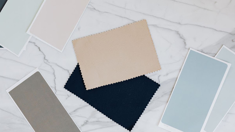
A pale blue shirt under a mid-blue knit with navy trousers is one of the easiest ways to look put together, and it takes no decisions beyond picking the color. The variation in depth keeps it from reading flat.
Texture matters more here than anywhere else. Three depths of the same color in three different fabrics is far more interesting than three in the same one.
Blue with orange, purple with yellow, green with red — high contrast and high energy. It works, but in a large dose it is a lot, so the usual approach is one dominant color and the opposite as a small accent rather than a fifty-fifty split.
Two garments can be the same color and still clash, because one has a warm undertone and the other a cool one. A yellowish cream beside a bluish white looks slightly wrong in a way that is hard to name until you know to look for it.
The quick test is to hold them together in daylight. One will usually look grubby next to the other, and that is the mismatch. Keeping your neutrals in one temperature family — all warm creams and camels, or all cool grays and pure whites — removes the problem entirely and is the most useful thing in most color coordination guides.
Even a good combination looks off in the wrong quantities. The rule of thumb worth borrowing from interiors is roughly two thirds dominant color, one third secondary, and a small fraction accent.
Equal thirds of three strong colors is the most common way an outfit goes wrong, and it is almost always fixable by demoting one of them to an accessory rather than changing the colors at all. Most outfit guides that tell you a palette "does not work" are really describing a proportion problem.
Pick your neutral family and keep it consistent, then add one accent at a time until a combination stops feeling like a risk. Try one color at three depths on a day you cannot decide, and save the high-contrast pairs for when you want to be noticed. It is a short list, and it opens up most of a wardrobe that was previously defaulting to black. More everyday style guides build on the same three ideas.
FactMates has more on putting outfits together, if that is the sticking point.